


 BLUE IS NOT my favourite colour. I have hardly ever worn jeans in my life for this reason. I am an autumn person, rusty ochrey muddy olivey burnt maroons adorn my work, my world and my body. I don't know why this is. Perhaps because I was born in the autumn, perhaps because there are not many natural things in the world with bright blue colouring (flowers aside, and berries, and the sky... hmm maybe blue isn't so scarce afterall!). A mudgy inky indigo can just about get away with it for me, but bright royal blue: absolutely not!
Strangely, though, I can also find some intense blues beautiful: Maroccan doors, Madonnas' robes, Medieval skies, but I struggle greatly to use these blues in my work.


Consider then, how difficult I found the fifth painting in the Chakra series which I am undertaking. Each of these paintings has to take a colour of the spectrum as its main hue. Number five was to be blue. And I couldn't lean towards indigo to make life easier, as the next painting has to be indigo, and the two must be distinct from each other.
 I tend towards a fairly limited palette when I paint, and the only blue I use is French Ultramarine. The name "Ultramarine" derives from Middle Latin 'ultramarinus', literally "beyond the sea" because it was imported from Asia by sea. Natural Ultramarine occurs as a component of lapis lazuli.
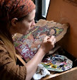
My oil painting technique has got more and more scratchily aged in recent paintings, which I like, and it was in this way that I think I managed to get a blue enough blue without it being garish. Bob likes it: particularly the eyes, the elephant and the blue; and he is currently sitting with it while he conjures words to describe what it evokes for him. I think it is appropriate that as a series of meditative paintings, that will serve almost as icons, blue is a necessary "heaven".
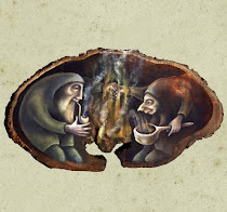
Here is Vissudha... it is about the voice and communication, creativity and purification.
Next comes indigo....