


 BLUE IS NOT my favourite colour. I have hardly ever worn jeans in my life for this reason. I am an autumn person, rusty ochrey muddy olivey burnt maroons adorn my work, my world and my body. I don't know why this is. Perhaps because I was born in the autumn, perhaps because there are not many natural things in the world with bright blue colouring (flowers aside, and berries, and the sky... hmm maybe blue isn't so scarce afterall!). A mudgy inky indigo can just about get away with it for me, but bright royal blue: absolutely not!
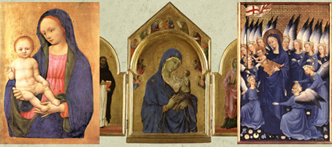
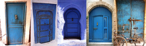
Strangely, though, I can also find some intense blues beautiful: Maroccan doors, Madonnas' robes, Medieval skies, but I struggle greatly to use these blues in my work.
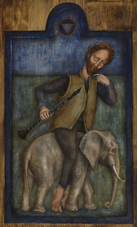
Consider then, how difficult I found the fifth painting in the Chakra series which I am undertaking. Each of these paintings has to take a colour of the spectrum as its main hue. Number five was to be blue. And I couldn't lean towards indigo to make life easier, as the next painting has to be indigo, and the two must be distinct from each other.
 I tend towards a fairly limited palette when I paint, and the only blue I use is French Ultramarine. The name "Ultramarine" derives from Middle Latin 'ultramarinus', literally "beyond the sea" because it was imported from Asia by sea. Natural Ultramarine occurs as a component of lapis lazuli.
My oil painting technique has got more and more scratchily aged in recent paintings, which I like, and it was in this way that I think I managed to get a blue enough blue without it being garish. Bob likes it: particularly the eyes, the elephant and the blue; and he is currently sitting with it while he conjures words to describe what it evokes for him. I think it is appropriate that as a series of meditative paintings, that will serve almost as icons, blue is a necessary "heaven".
Here is Vissudha... it is about the voice and communication, creativity and purification.
Next comes indigo....


24 comments:
Absolutely stunning, Rima.
Much love from a soggy Thames riverside.
xxx V.
Yes, there is blue in there and you seem to have managed it quite nicely. Another stunning piece for sure. All of it.
it is lovely Rima! as always!
in Iconology Blue is the color of the heavens ,as you have wrote. It is a higher spectrum of celestial energies. Browns and reds are the inner "animal-like" nature, greens are the "human" colors, blue and purple are the celestial energies. Purple being the highest color of all:)
I love blues, in all shapes and forms, love the examples of ultramarine you showd:)
It's interesting that you find blues to be garish or too bright. In the color theory of Liane Collot d'Herbois, blue recedes, while yellow streams forth and red holds in place (generally speaking). Blue is also seen as calming (a good bedroom color in feng shui, for example).
I've dyed silks with indigo before...it is such a wonderful color. I can't wait to see the next painting!
I love this painting. And, it still seems autumnal to me, even with your difficult blue. It's just wonderful, Rima. From the elephant, to the vest...is it leather?...to the tilted head and the wayward big toe. I love it.
Anchors and Masts sent me here after she read my post today about the fifth chakra, and wow! am I ever glad she did! This is gorgeous. The series is just gorgeous; your work is amazing. I especially love (so far) the heart chakra. The bird makes me smile.
It seems that we all come to this life with color preferences. I noticed this with my Grandson who is now 15 months old...he has a definite preference at this young age.
I have always loved the primary colors...yellow walls, red chairs, blue and white china. I adore to dress in purple...someone once told me that purple is an old lady color I prefer to think of it as a Regal color.
Beautiful artwork...I would love some of your dishes...I have an addiction to china and glass.
I am glad that you are on the mend.
Rima, I cannot get over the elephant! Simply stunning. The whole picture is just so beautiful. I do love blue, more than any other colour, though funny, I don't wear it an awful lot. Your solution is just so subtle and so gorgeous. And his eyes...oh, my heart...
And lovely girl, there is an open invitation to you two sweet things any time! I truly mean that. :-)
Its drop dead gorgeous ,And I love the blue used in the painting.I love blue.Hugs Marie Antionette
This is wonderful, Rima! And his eyes are so mesmerizing! You have made the blue very soft and mellow...a Rima blue!
I love cobalt blue and have bits of it around Willow Manor. I have several vintage blue bottles in window sills that come to life in the sunlight. And you are right, I didn't realize how many religious icons have the Madonna in that same vibrant blue!
Gosh I know just what you mean about being an autumn person and having those rich autumn colours resonate.......and you are part NZer, how wonderful, do tell me more.....
oohhhhh, lovely and breathtaking all at once, rima!!!
i once wrote an entire blog entry based on the color and concept and emotion of blue. blue moon, the emotion of feeling blue, the color of the sea and the sky - joni mitchell's album Blue - (album, not cd, mind you) - the moody blues - so much. it isn't my favorite color, i who was also born in the autumn (october). oddly, i don't have a favorite color...
you are amazing - i wish i knew how your mind worked itself into the various shadings of color, the textures, the - the sound of it. the sound and the smell. it is all there. xxx
Funny things is I also mostly wear browns, etc. sometimes a bit of grey and salmon pink, but never blue.
And that even though I was born in August and my name actually means "blue" in Bengali :D
Umm, blue is tricky, isn't it ? I too love the blue of Moroccan doors, and the blue skin of the Medicine Buddha in Tibetan iconography I absolutely love, but certain other blues strike me as rather cold and depressing.
A survey of student accommodation that came out when I was actually a student stated that people in blue-painted rooms were more likely to commit suicide than people in rooms that were green.
It is lovely Rima, truly. My favorite color (as you know) is red. I always find red to be like blue. In application difficult and can look garish. In your hands it is perfect.
I love elephants.
I'm still very much in a 'blue' phase at the moment. I think it's because I've spent a lot of time near the sea over the summer. I love blue but I rarely wear it (apart from jeans but they don't count!). It's good to see you back in action, this piece of work is stunning.x
An interesting note, there are some schools of thought that say that not liking certain (chakra) colors is highly correlated with 'issues' we have around that particular chakra. Your mileage may vary.
I *love* Moroccan blue doors..
I find this painting beautiful yet melancholic.. blue is often used to portray sadness or sorrow and your painting conjures up these emotions for me..
Utterly gorgeous, Rima! And I completely agree with you about blue. I rarely wear blue & I shy away from blue in my home, with the one exception of blue bottles on the windowsill. For some reason I only like blue when it's deep & transparent, like the twilight sky. I have an absolute aversion to light blues.
I've also noticed that I'm rarely happy with my paintings when they include blue, though other folks seem to like it & I continue to try it from time to time when I think the subject calls for it. I think your roughened, muted treatment is the perfect solution.
Oh this resonates! My favourite blue is the one you describe and I have been creating a mosiac with such a hue.
Your work is so very beautiful Rima.
Rima, it's so beautiful again! i absolutely feel with you about 'rousing' blue but this 'tired' autumnal blue is one of my favourites in paintings. this blue exceedingly assimilate to your other wonderful colours and add to your art a fantastic mood that i love so much!
Blue in nature... Our tenant rabbit eats blue flowers. :-) I have photos of them (and him) on my blog to prove it.
I was a little girl who loathed pink and loved blue. Lately I've been going through an orange craze, but I rarely stay put on one favourite colour long.
I've looked at all your chakra paintings. They're wonderful. I do chakra readings (not professionally) and I've recently been wondering about trying to put down what I see in pictures rather than words, especially when I see angels and totems.
But I'm not an artist on your level. I was kind of a C grade art student. I passed, but I never was outstanding (as you very much are!). Words have always been my first and best medium of expression.
I also have a great fear of garish colour,I made an oath to stick with slate blue,darkest indigo and navy that is far as I'll go.:-)
How interesting, because blue is my color, but love to wear rust and greens, I adore earth tones (which by the way looks terrible on me, because I am olive skin) When I wear this blue I feel rich and lucky!
Post a Comment